
You’ve scrolled through Amazon’s endless book listings and noticed something. Some covers grab your attention instantly — others vanish into the digital blur.
The difference isn’t accident. It’s strategic book cover design tips that create focal points strong enough to stop a browsing reader mid-scroll.
Most self-published authors treat their cover as an afterthought. They slap together text and an image, upload it, and wonder why their book sits unseen among millions of others.
What Makes a Book Cover Design Work
A focal point is the visual element that commands attention first. It’s the hook that pulls a reader’s eye from the surrounding noise.
Without one, your cover becomes wallpaper.
Look at any bestseller list. The covers that work all follow the same principle: they give your eye somewhere specific to land. They create hierarchy. They guide attention.
That guidance happens in milliseconds — the time it takes someone to decide whether to click or keep scrolling.
Book Cover Design Tips: 6 Ways to Create Visual Impact
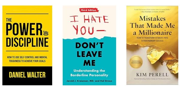
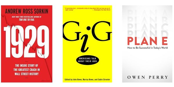
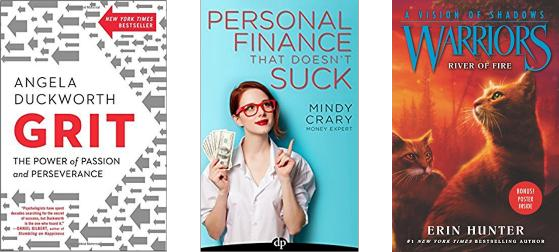
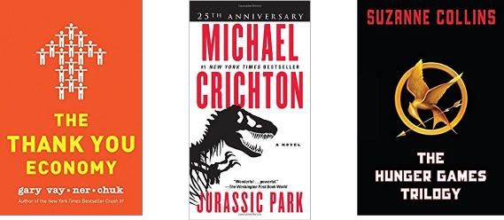
1. Use Contrast to Direct Attention
Contrast works because our brains are wired to notice differences. Light against dark. Large against small. Busy against simple.
You can create contrast through:
- Color choices — a bright title on a muted background
- Size variations — one large element surrounded by smaller ones
- Typography — bold text against thin text
- Texture — smooth against rough, clean against distressed
The key is making your contrast intentional, not chaotic. Pick one element to emphasize and let everything else support it.
Use contrast
2. Emphasize Only One Element
Too many focal points equal no focal points.
Look at your cover concept and ask: what single element best represents this book? A face? A symbol? The title itself?
Strip away everything that competes with that choice. If you’re using a photograph, crop it to show only the most essential part. If you’re working with multiple text elements, make one dramatically larger than the others.
Clarity beats cleverness every time.

Emphasize one element only
3. Go Extremely Big
Size commands attention in ways subtlety cannot.
Make your title massive. Or your central image. Or your author name if you’re already established.
This isn’t about shouting — it’s about confidence. A large element suggests the content inside is substantial enough to warrant the space.
Remember that most people will see your cover as a small thumbnail first. Elements that feel large in your design software might disappear entirely at actual viewing size.
Go extremely big
4. Use Faces and Silhouettes
Humans are programmed to notice other humans. We scan for faces unconsciously, even in peripheral vision.
A face doesn’t have to be a literal portrait. Consider:
- Silhouettes that suggest human forms
- Partial faces — an eye, a profile
- People viewed from behind
- Even animal faces for certain genres
The power isn’t in showing everything. It’s in triggering recognition.
Leave room for readers to project themselves into the image. A shadowy figure walking away can be more compelling than a fully detailed character portrait.

Use faces and silhouettes
5. Direct the Gaze
We follow where others look. It’s an evolutionary response we can’t override.
If your cover includes a person, position them looking toward your title or subtitle. If you’re using abstract elements, create visual flow that leads the eye to your most important text.
Arrows, pointing gestures, and even implied movement can guide attention exactly where you want it.
This technique doubles your impact — the face grabs attention, then directs that attention to your message.
Direct the gaze
6. Use Symbols
Symbols communicate faster than words. They bypass the rational brain and hit recognition instantly.
The best symbols are universal — a key for mystery, scales for justice, a lightbulb for ideas.
But avoid the obvious. If every book in your genre uses the same symbol, find a fresh way to present it. Combine it with unexpected elements. Change its scale or context.
Symbols work because they suggest larger concepts without requiring explanation. They let readers fill in meaning rather than being told what to think.
Use symbols
Common Book Cover Design Mistakes to Avoid
Most amateur covers fail because they try to tell the entire story. They crowd in multiple scenes, characters, and concepts.
Don’t illustrate a specific moment from your book. That’s too literal and too limiting.
Don’t try to fit all your characters on the cover. Choose one or suggest the group through silhouettes.
Don’t use colors simply because they’re pretty. Every color choice should serve your genre and mood.
Testing Your Book Cover Design
Before you commit to a cover, test it at thumbnail size. Most readers will see it small first.
Ask yourself:
- Can I read the title clearly?
- Does one element clearly dominate?
- Would this stand out among similar books?
- Does it communicate the right genre?
If you’re unsure, create multiple versions and test them with your target readers. Canva makes this process straightforward, even for non-designers.
Working with AI Tools for Book Cover Design
AI can help generate initial concepts and backgrounds, but it struggles with text placement and genre-specific requirements.
Use tools like Midjourney or DALL·E for background elements or conceptual inspiration.
Then move to design platforms like Canva or Adobe Express for final assembly and text work.
Remember: AI can create compelling visuals, but it can’t make strategic decisions about your target market or genre expectations. That’s still your job.
Genre-Specific Considerations
Different genres have different visual languages. Romance readers expect certain color palettes and imagery. Business book buyers respond to clean, professional layouts.
Study the top sellers in your specific category. Not to copy them, but to understand the visual expectations you’re working within.
You can innovate, but you need to signal the right genre first. Readers browse by visual cues before they read descriptions.
Budget-Friendly Book Cover Design Options
| Option | Cost | Best For |
|---|---|---|
| DIY with Canva | $0-15/month | Simple covers, tight budgets |
| Pre-made covers | $50-300 | Quick turnaround, genre fiction |
| Custom design | $300-800 | Unique vision, established authors |
Most self-published authors can create effective covers using pre-made options or design tools. The key is knowing your limitations.
If typography isn’t your strength, start with a template. If you need something completely unique, invest in custom design.
Create a book cover concept for my [GENRE] book titled “[TITLE]”. The book is about [BRIEF DESCRIPTION].
I want to focus on [MAIN THEME/EMOTION]. My target audience is [AUDIENCE DESCRIPTION].
Please suggest:
1. A primary focal point for the cover
2. Color palette that works for this genre
3. Typography style (bold, elegant, handwritten, etc.)
4. One symbolic element that represents the core concept
5. Layout approach (centered, asymmetrical, minimal, etc.)
Keep the design simple enough to work as a small thumbnail while being distinctive enough to stand out in the genre.
Your book cover is often the first interaction a potential reader has with your work. Make it count.
The difference between a cover that works and one that doesn’t isn’t talent — it’s understanding these fundamental principles and applying them consistently.
Focus on clarity. Create strong contrast. Give readers’ eyes somewhere specific to land.
Do that, and you’ll have a cover that doesn’t just look professional — you’ll have one that sells books.